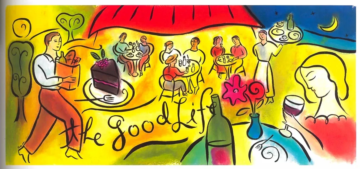
| Also known as | GVC |
| Period | Late 1980s – Early 2000s |
| Peak | Mid-1990s |
| Origin | Western corporate design |
| Named by | Evan Collins, CARI (2018) |
| Key traits | Earth tones, woodcut style, tribal imagery, aroma swirls |
| Successor | Y2K Futurism, Gen X Soft Club |
Global Village Coffeehouse
What is it?
Picture this: you’re nine years old in 1995. Your mom is dragging you into a Starbucks , not the sleek, glass-and-concrete minimalist ones of today, but the original kind. There are dark wood beams. There are earthy, rust-orange walls. There’s a mosaic of swirling tribal suns above the counter and a rack of compilation CDs called things like “Rhythms of the World” near the door. The whole place smells like roasted coffee and something vaguely resembling a rainforest. A woman in a linen vest is ordering a grande mocha. Sade is playing softly in the background. Nobody has a laptop. Everything is fine.
That place? That feeling? That’s Global Village Coffeehouse (GVC) , without question one of the most omnipresent visual languages most people have never had a name for. The term was coined in 2018 by Evan Collins, co-founder of the Consumer Aesthetics Research Institute (CARI), to describe a look that had been sitting in front of everyone’s faces for two decades: on coffee cup sleeves, on travel agency posters, on the walls of chain bookstores, in Microsoft Word clip art, in the illustrated backgrounds of school newsletters printed on beige recycled paper.
You know it instantly when you see it. You probably just never knew it had a name.
The name (and why it’s perfect)
The “Global Village” half comes from Marshall McLuhan’s famous 1960s concept , the idea that electronic communication was shrinking the world into one interconnected community. By the early 1990s, that phrase had been thoroughly absorbed into the cultural mainstream. The internet was arriving. World music was on the radio. Your local supermarket was starting to stock mango salsa. The world was, allegedly, coming together.
The “Coffeehouse” half is equally spot-on. The independent café was the sacred third space of the 1990s , not home, not work, but somewhere warm and community-oriented in between. Central Perk on Friends wasn’t just a set; it was an aspirational archetype. Chains like Starbucks, Panera Bread, Barnes & Noble, and Borders all built their interior design around exactly this feeling: come in, stay a while, feel like a citizen of the world.
History: where did it come from?
The first seeds of GVC were planted in the late 1980s as a direct reaction against two things: the sleek, neon-drenched excess of early 1980s design (Memphis Design’s bold geometry and sharp primary colors) and the rising tide of computer-generated everything. Designers and consumers were getting exhausted by the chrome-and-grid future, and a counter-swing began.
At the same time, a second wave of the environmental movement was building momentum. The late ’80s brought renewed public awareness about rainforest destruction, ozone depletion, and sustainability. This filtered directly into design as a kind of “greenwashing” instinct , brands wanted to look earthy and authentic without necessarily doing anything particularly earthy or authentic. Enter the hand-drawn sun. Enter the recycled-texture paper background. Enter the spiral motif that vaguely suggests both a seashell and a galaxy.
GVC hit its peak in the mid-’90s, the era when globalization was received with genuine optimism by the Western mainstream. World music , a marketing category invented to sell non-Western music to Western listeners , was booming. Paul Simon had released Graceland in 1986. Compilations like “The Rough Guide to…” whatever were flying off the shelves. GVC design was right there to absorb and commodify this fascination.
The look: a field guide
Earth tones, everywhere
Warm, slightly muted colors in the brown, terracotta, olive, burnt sienna, and ochre family. Sometimes a faded coral or dusty teal sneaks in. The overall effect should feel like pottery. Or a hiking trail. Or both.
Woodcut styling
The signature illustration style mimics the rough, hand-carved look of traditional woodcut printing. Lines have a slight imperfection. Fills don’t quite line up with their outlines , a technique shared with Keith Haring’s aesthetic, a major influence on the era.
Tribal and indigenous imagery
Kokopelli , the humpbacked flute-player figure from Southwestern Native American traditions , was practically the aesthetic’s mascot. Petroglyph-inspired imagery, stylized animal figures, and vaguely “ancient” motifs drawn from an enormous range of actual cultural contexts.
Aroma swirls
Possibly the most iconic single motif of the GVC era: curling, stylized steam lines rising from a hot beverage. They are to GVC what the checkmark is to Nike. Once you start looking for them, you cannot stop seeing them.
Suns, moons, spirals
The spiritual grab-bag of the era. Symbols borrowed liberally from ancient Egyptian, Celtic, Native American, and other traditions, simplified into cheerful, universally vague icons of warmth and holistic wellbeing.
Neo-hieroglyphics
Simplified, almost cave-painting-style human figures , dancing, celebrating, playing instruments. The figures you’d see on early Wired magazine website graphics, or in 1990s font packs with names like “Tribal Dingbats.”
Typography
Fonts were organic, hand-lettered, or hand-lettered-looking. Serif fonts with rough edges. Lettering that looked like it might have been painted by a skilled amateur with a wide brush. Nothing too clean. Nothing that looked like it came off a laser printer.
Where it lived
Starbucks
Howard Schultz’s vision for Starbucks in the 1990s was deeply GVC: an “authentic” coffeehouse experience run by a massive chain. Dark wood, warm lighting, local-feeling art, world music on the speakers. The branding was saturated with hand-drawn warmth. Starbucks’ logo , a mermaid rendered in a style that nods to old maritime woodcuts , was extremely GVC.
Barnes & Noble and Borders
Walking into a Borders in 1997 was a full GVC experience: warm colors, hand-lettered signs, world music CDs displayed near the door, a café inside that felt like the coffeehouse aesthetic made literal.
Microsoft Clip Art
You cannot talk about GVC without talking about the clip art libraries bundled with early versions of Microsoft Office. Those dancing figures, those celebrating people, those spiraling suns and smiling moons , all deeply, unmistakably GVC. An entire generation grew up using these images for school projects and church bulletins, absorbing the aesthetic without knowing it.
Food packaging
Fruitopia, the Coca-Cola juice drink launched in 1994, was bold GVC in a bottle. Snapple’s illustrations. Celestial Seasonings tea (GVC before GVC had a name). The packaging for granola bars, organic snacks, and herbal supplements throughout the ’90s was a masterclass in the aesthetic.
The music connection
GVC had a musical atmosphere perfectly matched to its visual language: call it “world fusion” or “new age adjacent” or just “what they played at Starbucks.” Artists like Enya, Loreena McKennitt, Peter Gabriel, and Paul Simon occupied the upper prestige end. The Putumayo World Music compilation series (launched 1993) became practically the official soundtrack, sold at Borders and Barnes & Noble. Early smooth jazz also fit: Diana Krall, Sade, Sting’s solo work. Album art from the era frequently used GVC imagery , earthy colors, hand-illustrated figures, ancient symbols. It was a whole package.
The complicated side: appropriation and greenwashing
GVC has been widely criticized, and not without reason. Its entire visual vocabulary rested on the casual borrowing , some would say outright theft , of imagery from Indigenous, African, and various ancient cultures, stripped of context and deployed to make chain restaurants feel warm and authentic.
The Kokopelli mugs sold at Pottery Barn weren’t accompanied by any information about who Kokopelli actually is to the Hopi, Zuni, and other Southwestern Native American peoples. The “tribal” prints on Avanti bathroom accessories weren’t in dialogue with any real tradition. They were, essentially, vibes extracted from living cultures and turned into décor.
Similarly, the environmental sincerity of GVC was largely performative. Brands using hand-drawn trees and recycled-looking textures weren’t necessarily doing anything more sustainable than their competitors , they were just looking more sustainable. This is the textbook definition of greenwashing.
The decline
By the late 1990s, the cultural pendulum was swinging back toward the future. Y2K anxiety and excitement were flipping the mood from earthy and global to sleek and technological. Gen X Soft Club and Y2K Futurism began pulling design toward clean lines, cool colors, and the visual language of airports and train stations. The world was getting online in a serious way, and the internet didn’t look like a woodcut , it looked like a browser window. GVC was essentially over as a dominant aesthetic by around 2003.
The revival
In 2023, GVC started going viral , particularly on TikTok, Instagram, and in online aesthetic communities. Gen Z creators were rediscovering it with fresh eyes, equal parts nostalgia (for a childhood they barely remember) and genuine curiosity about this weird, warm, slightly chaotic era of design. The appeal makes sense: the 1990s feel comfortingly pre-everything , before smartphones, before constant connectivity, before the algorithmic present.
Quick-reference checklist: is it GVC?
- Earth tones (browns, terracottas, ochres, dusty greens)?
- Hand-drawn or woodcut-style illustration?
- Aroma swirls, spirals, or ancient symbol motifs?
- Kokopelli, tribal imagery, or petroglyph-inspired figures?
- Dancing or celebrating human silhouettes in a simplified, cave-painting style?
- Texture that suggests recycled paper, rough linen, or natural wood?
- Typography that looks hand-painted or casually imperfect?
- Overall vibe: “this coffee shop definitely sells herbal tea and also has a didgeridoo on the wall”?
Four or more? You’ve got GVC on your hands. Congratulations , or condolences, depending on your relationship to the ’90s.
See also
- Gen X Soft Club , concurrent and successor aesthetic
- Frutiger Aero , successor aesthetic
- Y2K Futurism , concurrent aesthetic
- CARI , Global Village Coffeehouse
Gallery
Click any image to enlarge. Images load on demand.