| Also known as | FNW |
| Origin | Reddit dream post, Jan 2023 |
| Founded by | u/williamsaguaro2002 |
| Community | r/FotonightWeb |
| Parent aesthetic | Frutiger Aero |
| Related to | Shanzhai, Xpiritualism |
| Key traits | Bootleg Aero, dream-logic, Shanzhai design, garish color |
Fotonight Web
What is it?
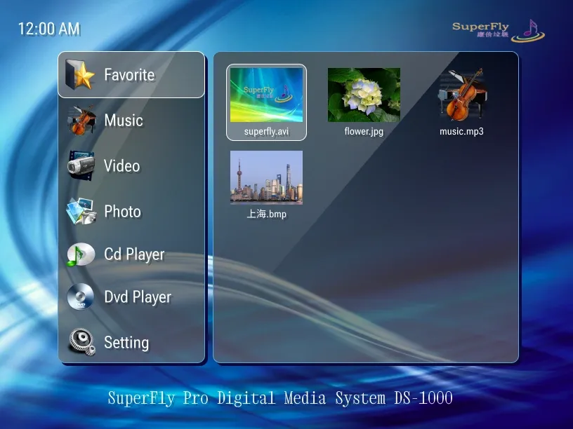
There is a specific kind of image that shows up on certain corners of the internet. A Mickey Mouse figurine, slightly off-model, posed in front of a garish background of blue sky and bubbles that is unmistakably trying to be Frutiger Aero and not quite pulling it off. The fonts are wrong , too many, too large, translated from Chinese via something that clearly isn’t a professional translator. The fish are too bright. The colors have been pushed past saturation into a kind of lurid unreality.
It feels like it was made by someone who had seen Frutiger Aero, internalized its general vibe, and then produced their own version of it with completely different tools, sensibilities, and goals. It feels like a dream someone had about the internet.
Fotonight Web is exactly that. It is simultaneously a meme aesthetic, a community-defined visual genre, a tribute to bootleg consumer culture, and the world’s most specific aesthetics wiki entry. It is also one of the most remarkable examples of how internet communities create meaning: a genre that exists because someone dreamed it, named it, and a subreddit decided it was real.
Origin: the dream
On January 2, 2023, a Reddit user named u/williamsaguaro2002 had an unusual dream.
In the dream, he had received a voice-acting job at Walt Disney Studios for a “big purple fish” character. The studio, however, was located in an underground secret base, which also contained aliens and nuclear weapons. While navigating this atypical workplace, he came across an elderly Asian man talking about something called “Fotonight Web,” who had an image associated with it , though upon waking, the dreamer couldn’t remember exactly what the old man had said or what the image showed.
He woke up with the name “Fotonight Web” stuck in his head and a vague but persistent visual impression of what it had looked like in the dream. On January 3, 2023 , the day after the dream , he posted about it on r/FrutigerAero, illustrated what he’d seen, and essentially asked the community: does this thing exist?
The community’s answer, in its own way, was: it does now.
The name
Nobody knows what “Fotonight Web” means, because it came from a dream where an elderly man said it and the dreamer woke up before getting an explanation.
This is actually perfect. “Fotonight” sounds like a portmanteau , maybe foto (Portuguese/Spanish for photo) + night , but that’s speculation. “Web” is clearly the internet, or possibly a spider web, or possibly something else entirely. Crucially, the name has a specific quality: it sounds like it was translated from another language through a process that wasn’t quite right. It sounds like something you might find as a brand name on a Chinese knockoff product. Which, as it turns out, is exactly the aesthetic the community landed on.
What Fotonight Web actually looks like
The community developed a visual aesthetic with two overlapping registers:
The meme register
Deliberately silly, intentionally low-quality, and openly absurdist. Mickey Mouse placed in a Chinese knockoff product environment. Garish bootleg merchandise with incorrect proportions. Surreal juxtapositions that don’t resolve into anything sensible , a fish next to a city next to a text box in three languages.
The “serious” register
The more visually coherent version: cheap, tacky, low-quality Frutiger Aero imagery that wasn’t made as a joke but still has this specific quality of being somehow off. A product graphic for a Chinese electronics brand with the Aero blue sky and green hills, but the proportions are slightly wrong and the fish aren’t quite the right kind and the font is Arial in a context where Arial shouldn’t be used. This is Fotonight Web as accidental aesthetic , it existed before it had a name.
Common visual elements
- Blue skies and bubbles (Frutiger Aero base elements, present and slightly wrong)
- Natural animals, particularly fish , but fish that are a little too bright, too many, too strangely positioned
- Water and green landscapes (Frutiger-derived)
- Auroras and aero glass effects , but garish or inverted
- Low quality Photoshop that’s clearly consumer-grade or less
- Non-sensical, dream-like visual arrangements
- Chinese bootlegs of established brands , particularly Disney, Apple, and Microsoft
- Mixed foreign languages (primarily Chinese and Japanese) in contexts where they don’t fit
- Mickey Mouse as a constant motif , whether legitimate or slightly wrong
- “Michaelsoft Binbows” energy , brand names that are almost right but not quite
The Shanzhai connection
Shanzhai (山寫) literally means “mountain stronghold” and refers to the Chinese practice of creating counterfeit, imitation, and parody products. It originally described copycat consumer electronics , fake iPhones, knockoff Nokias, bootleg Nikes. But Shanzhai evolved into something more interesting: not just cheap imitations but creative reimaginings, products that took a well-known design and transformed it through their own process of interpretation.
In visual design terms, Shanzhai produced a specific aesthetic: the look of something that has absorbed a Western design language and reproduced it with different tools, different quality standards, and different underlying assumptions about what elements are important. The result isn’t just “bad Frutiger Aero” , it’s Frutiger Aero as seen from a specific cultural and economic remove, processed through a different visual sensibility.
This is what the “serious” version of Fotonight Web documents: the Shanzhai life of an aesthetic, the version of it that exists at the edges of its transmission range.
Xpiritualism and the Chinese internet dimension
Xpiritualism describes a specific kind of internet spirituality that emerged from Chinese social media: the mixing of spiritual and religious imagery with internet vernacular, often in contexts that feel deeply incongruous to Western eyes. A serene Buddha next to some product text. Sacred geometry overlaid with hyperlinks.
Fotonight Web absorbs some of this quality. The dream-like juxtapositions, the mixing of apparently sacred or meaningful imagery with completely mundane commercial content, the sense that significance might attach to anything regardless of its actual context. A piece of Shanzhai promotional design for a USB hub that happens to include a Buddhist symbol, some fish, a poorly-rendered cloud landscape, and the phrase “good quality” in several languages , none of that was intended to be surreal, but the cumulative effect is.
The internet community
r/FotonightWeb launched in January 2023 in the immediate aftermath of the original post. The community has remained a niche interest within the broader Frutiger Aero world , not large, but active in the specific way that very niche internet communities tend to be. Fotonight Web is officially categorized as part of the “Frutiger Family” of aesthetics, sitting alongside Frutiger Eco, Dark Aero, and Technozen.
One notable recurring image is “Michaelsoft Binbows” , a real photograph of signage for a Chinese software shop that used “Michaelsoft” instead of “Microsoft” and “Binbows” instead of “Windows.” It perfectly captures the Shanzhai quality of the aesthetic: not a random error but a deliberate substitution that reveals the way brand names are understood at a certain distance from their origin.
Why this matters
Fotonight Web is a small thing , a meme aesthetic, a community niche. But it’s interesting precisely because of how it came into being. An aesthetic that was dreamed before it was seen. A community that decided something existed because someone said a name out loud. A visual genre that documents, affectionately and with genuine curiosity, the Shanzhai life of design languages , the way visual aesthetics travel across cultural and economic borders and arrive changed, stranger, and sometimes more interesting than the original.
Quick-reference checklist: is it Fotonight Web?
- Frutiger Aero base elements (sky, bubbles, fish, nature) , but slightly off?
- Colors pushed past comfortable saturation into the garish zone?
- Low-quality image compositing , things don’t quite fit together?
- Chinese or Japanese text in unusual contexts?
- Bootleg/knockoff character imagery (especially Mickey Mouse)?
- Dream-logic visual arrangements , things next to each other for no explicable reason?
- Brand names that are almost right but not quite?
- Overall vibe: “made in a dream about the internet by someone who had never quite seen it”?
Four or more? You’ve found a Fotonight Web artifact. Congratulations or condolences, depending on your relationship to the uncanny.
See also
- Frutiger Aero , parent aesthetic
- Weirdcore , related dream-logic aesthetic
- r/FotonightWeb , the community
- r/FrutigerAero , parent community
Gallery
Click any image to enlarge. Images load on demand.