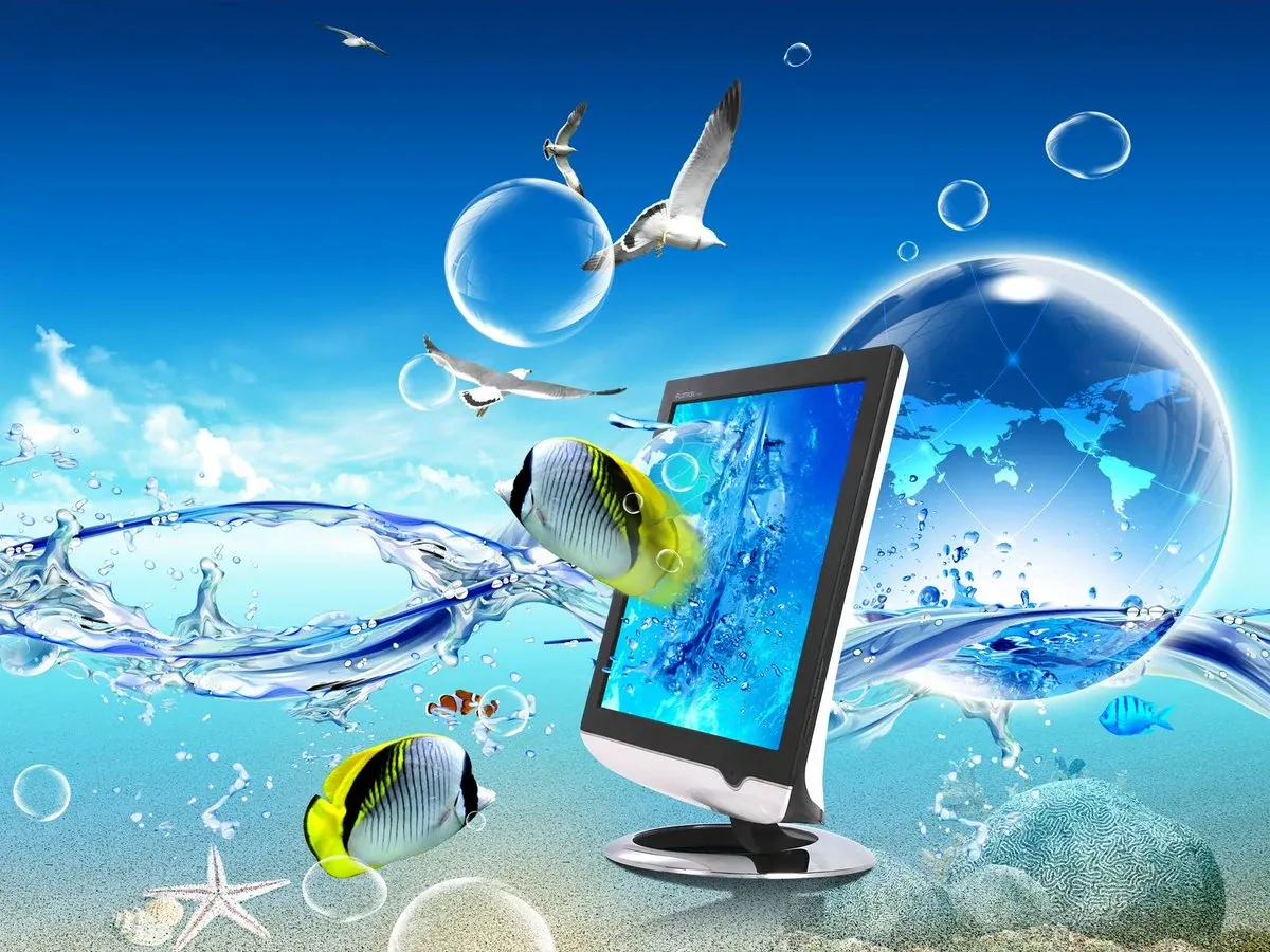
| Also known as | Web 2.0 Gloss |
| Period | 2004 – 2013 |
| Origin | Global (tech/corporate) |
| Preceded by | Y2K Futurism |
| Concurrent with | Vectordelia, Recession Pop |
| Succeeded by | Flat Design |
| Named by | Sofi Xian, CARI (2017) |
| Key traits | Skeuomorphism, glass, nature, bokeh |
Frutiger Aero
What is it?
You know those Windows Vista wallpapers? The ones with the gorgeous curling aurora against a deep blue sky? Or the Windows XP “Bliss” background , that impossibly green hill under an impossibly blue sky , which turns out to be a real photograph of Sonoma County, California? Or the Wii menu, with its soft chimes and that gently pulsing blue light? Or the original iPhone home screen, where every icon looked like a little jewel , glossy, three-dimensional, practically edible?
All of that is Frutiger Aero. It is the look of the 2000s, in the same way that neon Memphis squiggles are the look of the ’80s and grunge flannel is the look of the early ’90s. It was everywhere from about 2004 to 2013, so ubiquitous that nobody bothered to name it at the time. It was just… how things looked. How the future looked, or at least how a certain optimistic version of the future was imagined.
The name was coined in 2017 by Sofi Xian of the Consumer Aesthetics Research Institute (CARI). By then, the aesthetic had already faded from the mainstream , but naming it turned out to be the first step in bringing it back.
The name: a two-part origin story
Frutiger
Adrian Frutiger (1928–2015) was a Swiss typeface designer who spent his career making fonts that were clean, readable, and human. His most famous typefaces , Frutiger, Univers, Avenir , were designed for maximum legibility in demanding environments: airports, hospitals, signage systems. The Frutiger family was created for Charles de Gaulle Airport in Paris and became the visual standard for transportation infrastructure worldwide.
In the 2000s, Frutiger’s humanist sans-serif philosophy directly inspired Microsoft’s Segoe UI font (used in Windows Vista and beyond) and a whole generation of clean, friendly digital typography. His sensibility , his “humanist” approach to letterforms , was baked into the DNA of the entire aesthetic.
Aero
This half comes from Windows Aero, the visual design language introduced in Windows Vista. “Aero” was a backronym: Authentic, Energetic, Reflective, and Open. In practice, it meant translucent window borders you could see the desktop through, glassy icons that caught virtual light, and an interface that felt genuinely futuristic without being alienating. Windows Vista had its problems , but visually, it was extraordinary.
History: from Longhorn to Flat Design
Primitive stages (2000–2004)
The earliest signs appear right at the millennium, in two parallel developments. At Microsoft, engineers were beginning work on “Longhorn” , the codename for what would become Windows Vista. The Aero interface, with its glass-like translucent elements, was taking shape alongside Windows XP’s iconic “Bliss” wallpaper , a real photograph of rolling green hills under a perfect blue sky brought to hundreds of millions of screens.
At Apple, Mac OS X launched in 2001 with the Aqua interface , round, colorful, glossy, friendly. The Aqua name itself was telling: the design evoked water, translucency, light refraction, the feeling of something real and physical made digital.
Mainstream adoption (2004–2007)
The proper Frutiger Aero era begins in earnest around 2004. The Nintendo DS arrived with bubbly menus. Apple launched the iPod “Silhouette” campaign, establishing vivid saturated backdrops and joyful forms as a visual vocabulary. The Sony PSP arrived with the XrossMediaBar interface , floating icons that looked like something from a stylish science fiction film.
Then the seventh generation of consoles arrived: the Xbox 360 (with its Blades dashboard), the PlayStation 3, and the Nintendo Wii. The Wii in particular is perhaps the most perfectly Aero object ever made: its white-and-chrome design, bubbly menus, cheerful channel icons, and ambient menu music all felt like a small piece of the future that was actually nice to live in.
Peak years (2007–2012)
In 2007, three things dropped that together define the era perfectly. Windows Vista went on sale , the Aero Glass interface with translucent taskbars, glassy window borders that caught virtual light. Mac OS X Leopard arrived with its 3D Dock, reflective surfaces, and the purple “Aurora” default desktop. And Steve Jobs walked on stage at MacWorld to introduce the iPhone: skeuomorphic heaven, every icon a tiny physical object.
During these years, the aesthetic saturated consumer culture , airline advertising, mall interiors, stock photography (those blades of grass! those water droplets! those fish!), car concept designs, and an enormous range of products from iDogs to water-filled computer mice.
The decline (2012–2013)
The end came relatively quickly. In 2012, Windows 8 debuted with the Metro design language , flat, colorful tiles, no gradients, no glass, no depth. The Wii U launched the same year as the last major gaming console to fully embrace Frutiger Aero. Then in 2013, Apple released iOS 7: under Jony Ive’s new design leadership, skeuomorphism was completely abandoned. Flat, thin, minimal. No more felt, no more leather, no more glossy jewel-like icons.
The revival (2022–present)
The revival came on TikTok in late 2022. The hashtag accumulated over 30 million uses. The r/FrutigerAero subreddit passed 100,000 members. A dedicated archive site launched as a labor-of-love tribute. The nostalgia had layers: for millennials, it was the look of their teenage years. For Gen Z, it was a nostalgia for an era they barely lived through , an aesthetic that felt cleaner and more hopeful than the flat, algorithm-optimized internet they’d grown up with.
People kept using the phrase “the future they promised us” , shorthand for the feeling that the 2000s had offered a vision of technology as friendly, optimistic, and in harmony with nature, and that vision had somehow failed to arrive. Apple’s Liquid Glass design language, announced in 2025, was widely noted as a direct heir to Frutiger Aero’s translucent, physically-inspired aesthetics.
The look: a field guide
Glossy everything
Buttons that look like polished plastic or glass. Icons with a highlight at the top, as if light is falling on them. If it looks like you could poke it and it would feel like something, it’s probably Frutiger Aero.
Skeuomorphism
Digital interfaces resembling physical counterparts. A calendar that looks like a paper calendar. A bookshelf in iBooks that looks like actual wood. Design to ease digital newbies into unfamiliar territory by making everything look familiar.
Nature + technology
A gleaming glass skyscraper next to a perfect green meadow. A holographic globe floating above flowers. Technology that coexists with nature in some utopian arrangement. The visual language of 2000s eco-optimism.
Bokeh & soft light
Those beautiful blurred background light circles when depth of field is shallow. Adopted as a visual motif everywhere , advertising, wallpapers, interface backgrounds. Suggests warmth, depth, and a world beyond the frame.
Aurora borealis
Northern lights imagery was enormously popular , it bridged the natural and technological. An aurora looks like a computer-generated light show even when entirely real. Windows Vista’s default login background was an aurora.
Bubbles & water
Clear, spherical, reflective bubbles were everywhere. The PS Vita’s home screen , a field of floating, touchable bubbles , was one of the purest expressions of this motif in the aesthetic’s history.
Tropical fish
Fish in crystal-clear water, seen from below with light filtering down, became a genuine icon. It appeared on Palmolive dish soap, on screensavers, on wallpapers. The sub-aesthetic is now officially named Helvetica Aqua Aero.
The color palette
Blues, greens, whites, with occasional purples, teals, and warm yellows. The palette of a sky-reflected lake. Of a utopian future where the air is clean and the wifi is fast.
Subgenres (the Frutiger Family)
Frutiger Eco
Environmental and sustainability imagery , wind turbines against glowing skies, green architecture, happy animals in clean habitats. Basically the visual language of a 2007 sustainability report.
Dark Aero (Mata Nero)
Flips the palette toward blacks and dark blues while keeping glass and gloss elements. Think PlayStation 3 menus, or high-end tech advertising. Same depth, different mood , midnight rather than midday.
Technozen
The Japanese cousin: cleaner, cuter, slightly more kawaii. Nintendo DS menus, Wii home screens, certain Sony aesthetics. A cozy sterility that’s distinctly Japanese tech design.
Helvetica Aqua Aero
The fish and water sub-branch: aquariums, oceans, clear water, aquatic life. The intersection of Frutiger Aero and the beach. Palmolive. Softsoap. The Windows 7 fish wallpaper.
Frutiger Aurora
Specifically the northern-lights imagery: dynamic colored curtains of light against dark skies, used in everything from desktop wallpapers to TV channel idents to the Windows Vista login screen.
Four Colors
Electric lime, sky blue, hot pink, and neon orange. Emerged from Apple’s iPod Silhouette campaign. Popular in Japan, where the four colors were associated with the four seasons.
DORFic
Abstract tech minimalism , Daylight, Orange, futurism, graphic. Popular mid-2000s to mid-2010s. Think Sony Ericsson advertising and daylight-toned clean compositions.
Technology list
Canonical Frutiger Aero hardware and software , the greatest hits of the era:
Movies
- Robots (2005)
- Sky High (2005)
- Chicken Little (2005)
- Meet the Robinsons (2007)
- Bee Movie (2007)
- WALL-E (2008)
- Ponyo (2008)
- Avatar (2009)
- Astro Boy (2009)
- Despicable Me (2010)
- Rio (2011)
- The Lorax (2012)
- Your Name (2016)
- Tomorrowland (2015)
- Free Guy (2021)
Video games
- Nintendogs (2005)
- “Wii” series (2006–2011)
- Portal (2007)
- Super Mario Galaxy (2007)
- Mirror’s Edge (2008)
- Spore (2008)
- Flower (2009)
- The Sims 3 (2009)
- PlayStation Home (2008)
- Super Mario Galaxy 2 (2010)
- Portal 2 (2011)
- Pikmin 3 (2013)
The sound of Frutiger Aero
Frutiger Aero had a sound as much as a look. The Wii menu’s ambient theme , those soft, plinking, slightly aquatic tones , is probably the most instantly recognizable. The Windows Vista startup sound (composed by Robert Fripp), with its mysterious shimmering texture, is another candidate.
More broadly: airy, synthetic, hopeful electronic music. Owl City’s early albums (Ocean Eyes, 2009) are frequently cited as the definitive Frutiger Aero sonic experience. Jan Cyrka’s “Golden Sky” (used in the famous “A Day Made of Glass” concept videos) is another touchstone. Nokia and Sony Ericsson ringtones from the era , brief, glassy, synthesized melodies , are deeply evocative for anyone who owned a mid-2000s phone.
There are, genuinely, 32-hour Frutiger Aero ambient music playlists on YouTube. People listen to Wii menu music for eight hours while working. This is a fact about the world we live in, and it’s actually kind of beautiful.
Why it matters (and why people miss it)
Frutiger Aero was, at its core, an expression of a specific kind of optimism: the belief that technology was going to make life better, that the digital and natural worlds could coexist harmoniously, and that the future was going to be bright and clean and accessible to everyone.
It was the design language of a moment when home computers were still a wonder, when the internet felt expansive rather than suffocating, when a shiny new phone felt like a miracle rather than a tether. The interfaces were tactile because physical interaction with technology was still new and exciting.
The current aesthetic , flat design, Corporate Memphis, the algorithmic sameness of every app and website , feels, by comparison, designed to be processed rather than enjoyed. Optimized rather than felt. Frutiger Aero looked like a future people actually wanted to live in. That’s why people miss it.
Quick-reference checklist: is it Frutiger Aero?
- Glossy, reflective surfaces on digital elements?
- Translucent or glass-like interface components?
- Nature imagery (grass, water, fish, bubbles, sky)?
- Bokeh or soft light effects?
- Aurora borealis or northern lights imagery?
- Rounded, 3D-looking icons with highlights?
- Clean, humanist sans-serif typography (Segoe UI, Frutiger)?
- Blues, greens, and whites as the primary palette?
- Overall vibe: “this operating system wants to take you on a gentle nature walk”?
Four or more? Frutiger Aero confirmed. Adjust your nostalgia levels accordingly.
See also
- Gen X Soft Club , contemporary alternative aesthetic
- Y2K Futurism , predecessor aesthetic
- Flat Design , successor and antagonist
- Corporate Memphis , successor’s successor
- r/FrutigerAero , active community
- CARI , Consumer Aesthetics Research Institute
Gallery
Click any image to enlarge. Images load on demand for performance.