| Period | Mid-2000s – Mid-2010s |
| Peak | 2007 – 2013 |
| Origin | Western corporate and interior design |
| Preceded by | Memphis Design, Y2K Futurism |
| Concurrent with | Frutiger Aero, Four Colors |
| Succeeded by | Flat Design, Corporate Memphis |
| Key palette | Lime green, teal, orange, fuchsia, purple |
| Key motifs | Round edges, Bayadère stripes, flower patterns |
Bright Tertiaries
What is it?
You know exactly what this is. You’ve sat in a chair this color. You’ve eaten lunch off a plate this shade of lime green. You had a phone , a chunky, slightly rounded phone in teal or orange or fuchsia , that you kept in a bag that had a flower pattern in the same four-color palette. Your school had furniture in these colors. Your doctor’s waiting room still has furniture in these colors, because nothing that was built to furnish a 2007 primary school has ever been thrown out.
Bright Tertiaries is what the mid-2000s looked like. Not the silver chrome Y2K fantasy of 1999, not the beige minimalism of what came after , the actual 2005 color experience, which was lime green and teal and orange and fuchsia and purple all in the same space, applied to everything from children’s furniture to Nokia phones to sports gear to, inexplicably, the upholstery of transit hubs.
It is a design aesthetic built on tertiary colors applied with confidence and no particular restraint. It looked like the world had learned color theory in the 1980s and spent twenty years deciding what to do with it.
History
Roots: the 1980s
Bright Tertiaries didn’t emerge from nowhere. Its deepest ancestors are in Memphis Design , the 1980s Italian movement that used bold blocks of contrasting color in furniture and objects, treating color as structure rather than decoration. Memphis Design was chaotic, argumentative, and extremely pleased with itself. Bright Tertiaries borrowed the contrasting-color-blocks idea and mellowed it considerably, replacing Memphis’s confrontational geometry with something rounder, friendlier, and more corporate-friendly.
Late 2000s emergence
By the time Bright Tertiaries entered its mainstream phase, the design world was reacting against the “anything goes” maximalism of late-’90s/early-’00s aesthetics , Y2K Futurism’s chrome and starfields, the visual chaos of early internet design. The early 2000s had been a lot. The post-2005 world wanted something more organized.
It ran in parallel with Frutiger Aero , both aesthetics shared the same moment, the same philosophy of technological optimism grounded in human experience , but where Frutiger Aero leaned toward gradients and glossy surfaces, Bright Tertiaries preferred flat blocks of color and bold pattern.
Prime years: roughly 2007–2013
During this window, Bright Tertiaries was essentially everywhere. Interior designers were specifying it for schools, hospitals, gyms, libraries , any public space where the brief was “welcoming and functional” and the person writing the brief was alive to what 2009 looked like. The architecture was doing the same: color panels, bold accents, rounded forms. Consumer electronics ran a variant that overlapped heavily with the related Four Colors aesthetic, in which the same palette appeared on iPod accessories, game peripherals, and phone covers.
The decline: mid-2010s
By 2015 or so, the mood had shifted. The optimism of the 2000s was harder to sustain. The design world pivoted toward Flat Design , the visual equivalent of lowering the volume, replacing Bright Tertiaries’ confident color story with flatter, simpler digital interfaces. By 2017, Flat Design had won. Corporate Memphis came next. The rounded, lime-green-and-teal world of the 2000s became something you found in buildings that hadn’t been renovated yet.
Visuals
The core palette: lime green, teal, and then either purple-and-orange or fuchsia, depending on the variant. There’s a common secondary version that runs on fuchsia, cyan/teal, and lime green without orange , slightly more graphic, slightly more digital. Both feel immediately of their moment.
Round edges
Everything was rounded in 2007. Nothing had a sharp corner. The aesthetic’s geometry was soft, friendly, and deliberately approachable , corners were a form of design hospitality.
Bayadère stripes
Irregular colorful stripes, named for a woven pattern, that appeared on everything from clothing to classroom walls. One of the most recognizable single motifs of the era.
Flower patterns
Nature iconography, particularly flowers, which occupied a strange middle ground between actual naturalism and pure graphic motif. Flat, bold, unmistakably designed.
Flat color blocks
Unlike Frutiger Aero’s gradients and gloss, Bright Tertiaries preferred large flat blocks of a single hue. The look was designed to feel “humanistic” , modern but not cold, technological but not alienating.
Where it appeared
Interior design and architecture
The dominant application. Schools and colleges were particular hotspots , walk into any secondary school built or refurbished between 2005 and 2013 and you will find at least one wall, one set of chairs, or one breakout space that runs the full Bright Tertiaries color story. Leisure centers, medical waiting rooms, and retail environments followed.
Clothing
Bright Tertiaries fashion leaned toward flower prints and simple patterns, often on a black background, usually aimed at women and girls. The overlap with the related Vectorgarden aesthetic is significant here , both drew on the same vocabulary of bold, flat, slightly abstract botanical motifs.
Consumer electronics
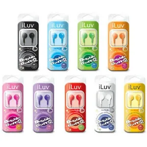
The phone and accessories market was awash in Bright Tertiaries colorways. The Nokia Asha, various iPod accessories, chunky portable speakers , all translated the palette into product design. The era’s phones were not black, not silver , they were fuchsia, lime, orange.
The emotional register
Bright Tertiaries felt like institutional optimism , the color story of a society that believed it could make public spaces feel better through the application of lime green and teal. There’s something genuinely touching about that belief, especially viewed from a more skeptical present.
It’s also the color story of childhood for a specific generation , people who went to school between approximately 2003 and 2013, who ate lunch at lime-green tables, had their first computer lessons in rooms with teal accent walls, owned at least one phone or device in a color that was not black, white, or silver. The nostalgia for Bright Tertiaries is not the nostalgia of someone who chose it. It’s the nostalgia of someone who was surrounded by it at a formative age and only realized afterward that it was a thing with a name and a history and an ending.
Quick-reference checklist: is it Bright Tertiaries?
- Lime green, teal, orange, or fuchsia as primary colors?
- Multiple bold tertiary colors in the same space?
- Rounded, soft-cornered forms , nothing angular?
- Bayadère stripes or bold flower patterns?
- Flat color blocks rather than gradients or gloss?
- Interior design from a school, hospital, or public building?
- Consumer electronics in anything other than black, white, or silver?
- Overall vibe: “this was designed in 2009 to feel welcoming”?
Four or more? Look around the next public building you walk into that was built before 2015. You’ll find it.
See also
- Frutiger Aero , concurrent aesthetic, different surface treatment
- Gen X Soft Club , concurrent, very different palette
- Memphis Design , predecessor with shared DNA
- Flat Design , successor and antithesis
Gallery
Click any image to enlarge. Images load on demand.